This summer volunteers are fanning out in 13 cities across the U.S. to — quite literally — take the temperature of their neighborhoods. It’s part of a project to help protect people as the world warms, and in many places it’s highlighting how the poorest areas suffer most from rising urban heat.
Take the Dove Springs neighborhood of Austin.
Like much of the city, Dove Springs was built for the car. Just off the highway, four lane roads with strip malls and apartment blocks lead commuters to winding blocks of 70s era single family homes.
It’s a Hispanic and working-class part of town, known locally for the damaging floods that tore through in 2013 and 2015. (A study published last year found that, nationwide, poor Americans are also more likely to live in flood-prone areas.)
Frances Acuña, a longtime resident and community organizer focused on public health, says she’s noticed Dove Springs is getting hotter. Records back that up. In the last couple of decades long stretches of triple digit days have become common, and nights aren’t cooling down like they used to.
“I was noticing yesterday as soon as I got out, it was like the heat was penetrating into my skin,” Acuña said on a recent August morning.
A big contributor is climate change. But in cities, asphalt and concrete are making it worse. They absorb heat, then radiate it back into the air, in what’s called the urban heat island effect. Even within cities it can change the temperature by ten to fifteen degrees in a matter of blocks.
It is often lower income parts of town, like Dove Springs, that are the hottest. In fact, a national study this year linked hotter temperatures to areas subjected to discriminatory, race-based housing practices nearly a century ago.
These are also the places where people have fewer resources to combat heat-related illness. So, for Acuña, it’s an environmental justice issue.
“We have more asthma cases, we have more respiratory infections,” she says. “I believe all this has to do with the heat.”
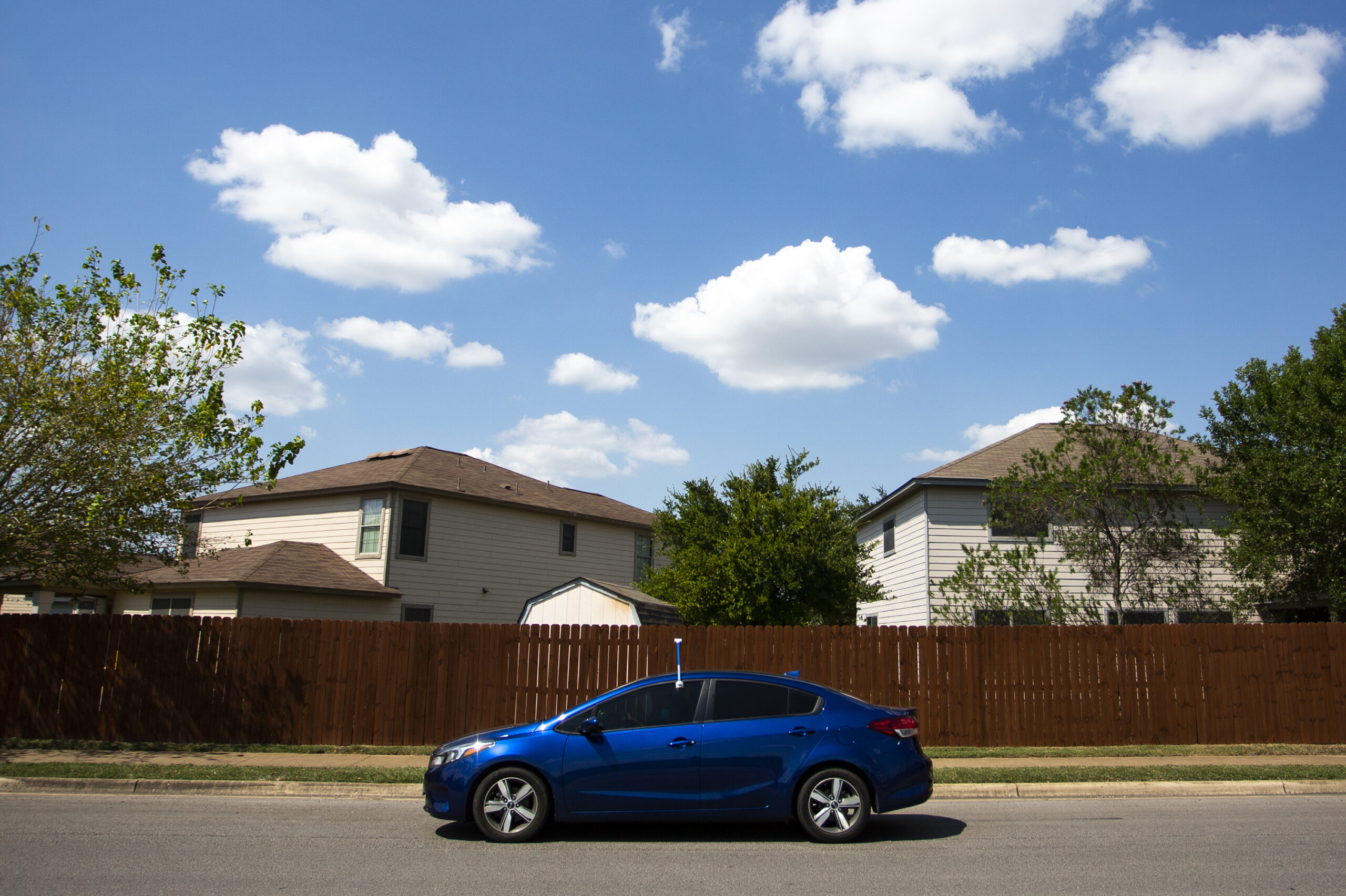
That’s why she’s one of twelve Austin volunteers who agreed to attach a specialized sensor to the side of her car, and drive through a neighborhood to create highly detailed heat maps.
Measuring the “true impact” of heat
The sensors “stick out like… snorkels,” says Marc Coudert of Austin’s Office of Sustainability. He’s helping organize the project, which is funded by the National Oceanic and Atmospheric Administration.
Cities normally use satellite data to create heat maps. But that measures only surface temperature, so places like mall parking lots and airports show up hottest.
“We don’t want to use that as a mechanism to invest in Austin to reduce heat,” says Coudert. “Because there are very few people who live at the airport, there are very few people to none who live in malls.”
Instead, volunteers mount sensors on their car or bicycle and head out on specially designed routes, morning, noon and evening on a single day. They capture both temperature and humidity, which are then used to calculate the heat index that people actually experience where they live, work and play.
“The routes are very specific and very confusing,” Coudert says. He shows off a map marked with squiggly lines.
Frances Acuña attaches her sensor to the driver’s side door and sets out with a friend along to navigate. The temperature is hitting triple digits and she sees things that make that worse.
“There’s a bus stop right here with no shade structure,” she points out. She says she often sees neighbors waiting there, and “sometimes I give them a ride because I feel for them.”
Passing by her son’s school she mentions how he comes home on hot days dehydrated and “red, completely red.” In an area buzzing with new construction she talks about how her brother works as a roofer and struggles in summer sun.
“I think the more you live in this heat… the more resilient people become,” she says. “But at the end of the day, that’s where you have years cut from your life.”
The Centers for Disease Control and Prevention estimates that more than 600 people in the U.S. die every year from extreme heat. But a recent study suggests the number may be far higher, upwards of 5,000 annually, with even moderate heat waves increasing the number of deaths.
Marc Coudert says along with the actual maps, observations like Acuña’s will help officials understand the “true impact” of heat in Austin neighborhoods.
Finding ways to cool down
After the data is gathered and calculated, the new heat maps will help Austin and other cities find ways to cool the hottest areas.
Such projects could be simple, such as planting more trees, building shade structures, or creating more crosswalks so people can quickly get out of the sun.
They could also be more complicated.
“Maybe it isn’t structure, maybe it’s actually policies,” says Coudert. “Maybe it’s how we set up times that places are open. Maybe it’s understanding how people get to a grocery store from home, and have to take two buses instead of one. Maybe it’s something we haven’t thought about.”
The highly localized maps could also advance science on a global scale.
“We don’t really understand fully everything there is to know about urban heat islands yet,” says Hunter Jones, with the National Oceanic and Atmospheric Administration.
Jones says researchers will use the maps to learn how urban heat interacts with climate change, and what strategies work best to combat it.
“It would be interesting to go back and look at some a few years later to see how things have changed, both intentionally and unintentionally, to see how things have developed,” he says.
In Austin, Frances Acuña says there’s no time to lose for her community. “If we don’t do something about the heat now, it’s gonna get a lot worse.”
Copyright 2020 KUT 90.5. To see more, visit
KUT 90.5.
9(MDAxODM0MDY4MDEyMTY4NDA3MzI3YjkzMw004))

9(MDAxODM0MDY4MDEyMTY4NDA3MzI3YjkzMw004))


